Alipay EU
Company: Ant Group (Alipay)
Division: International
Role: Senior Product Designer (UI)
Alipay EU (European) is the continuation of our team's international ewallet efforts. This time concentrating in the EU market. The product piggybacked off of Alibaba's huge e-commerce platform AliExpress, leveraging its already substantial userbase and to familiarize them with the ewallet concept.
The first version is seeing steady growth with the Standalone version ready to be deployed in time for UEFA (which Alipay is a huge sponsor), then COVID happened and the world sort of stopped.
Things will hopefully be back on track in the near future and we can see the standalone version online.
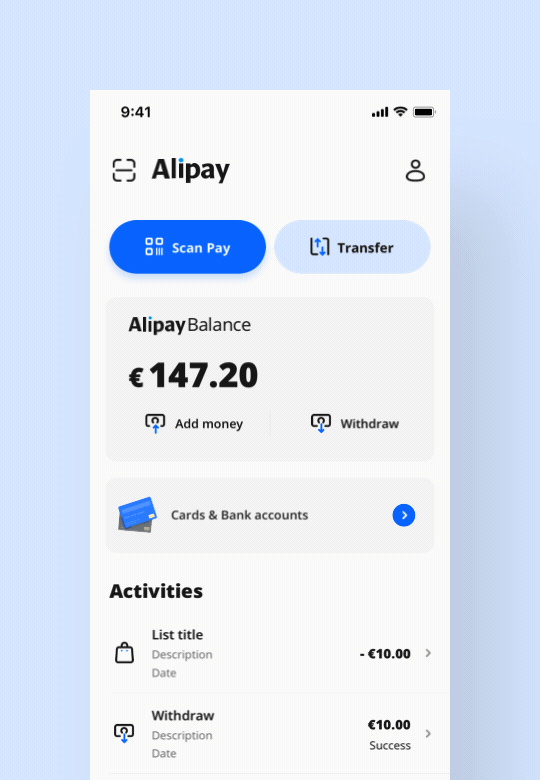
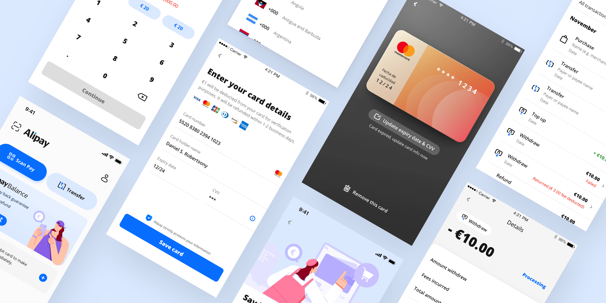
Minimalist dashboard for fast access and currency flow.
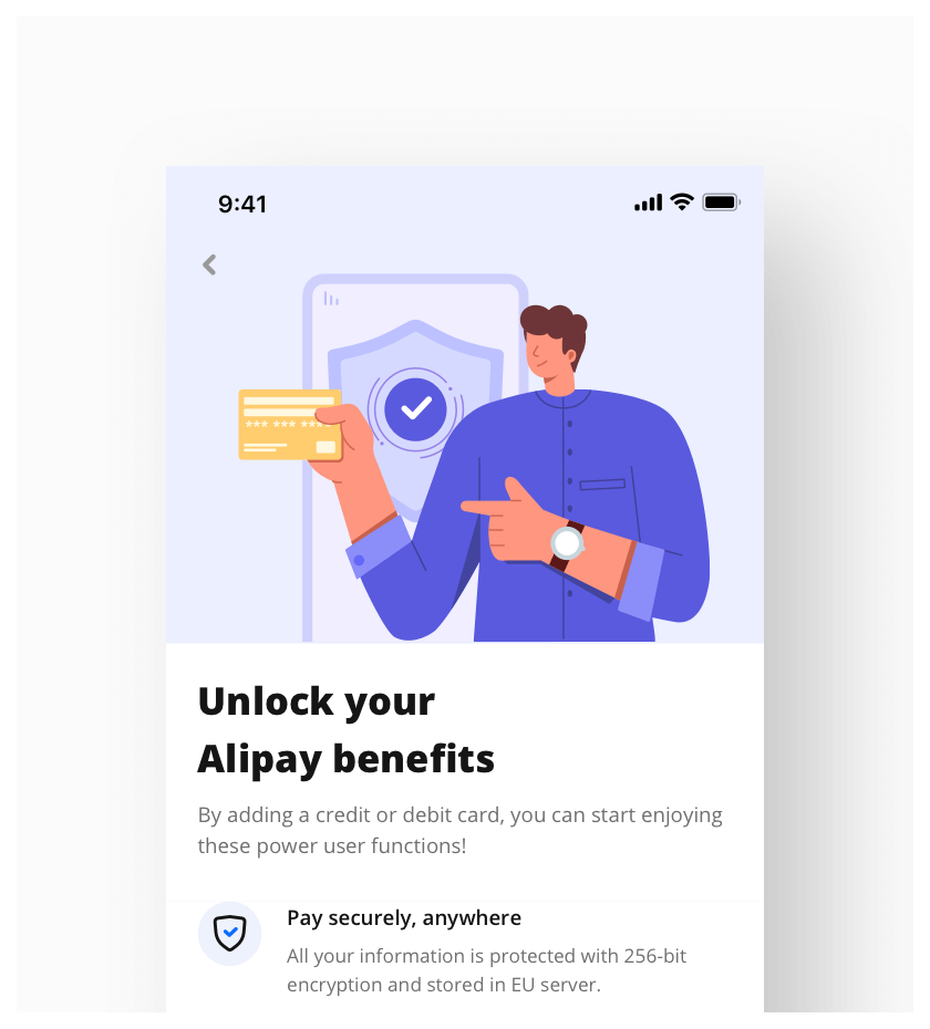
Adding dashes of visual delight throughout the journey.
Creating a friendly vibe for our users.
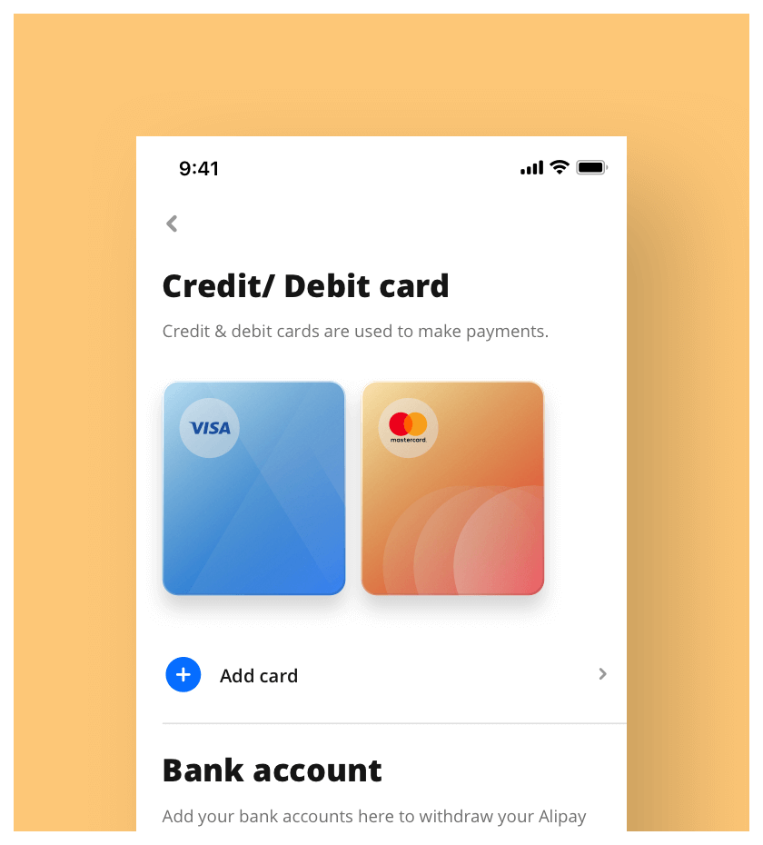
Beautiful rendition of your assets.
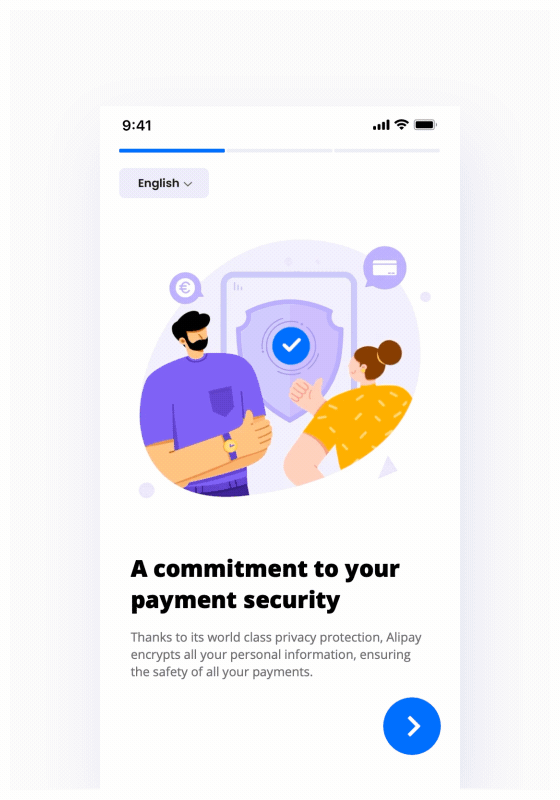
Animated onboarding for extra happiness :)
Some thoughts
The biggest challenge for us was to design a product that our European users will instinctively understand. Because a large part of working in a giant enterprise is that there will be many preconceived methods of design and solutions; these flowchart designs does not work when facing a different culture/market.
To overcome this there were extensive research and user testings done. From a UI standpoint, the standalone version went through a complete overhaul with what we concluded as a vision that respects our EU users, one that they will enjoy using without roadblocks, one that will delight.
Some key principles:
- Reduce clutter; Chinese sense of presenting information is overwhelming
- Space it out; it doesn't matter if information is not in first fold
- Make it friendly; Conversational UI, bolder/larger typography
- Accessible; Design for everyone, accessible colors
- Delight; Warm illustrations, elements that move
Design System
By this point, having a design system in place is standard practice. Be it to save resource or to maintain a high level consistency. Having a system in place means that our UX people are able to create high visual fidelity designs, without the need of inserting extra UI efforts in the pipeline.
Working with our developers, we have a library of code components ready to be plugged in, which greatly reduces development time.
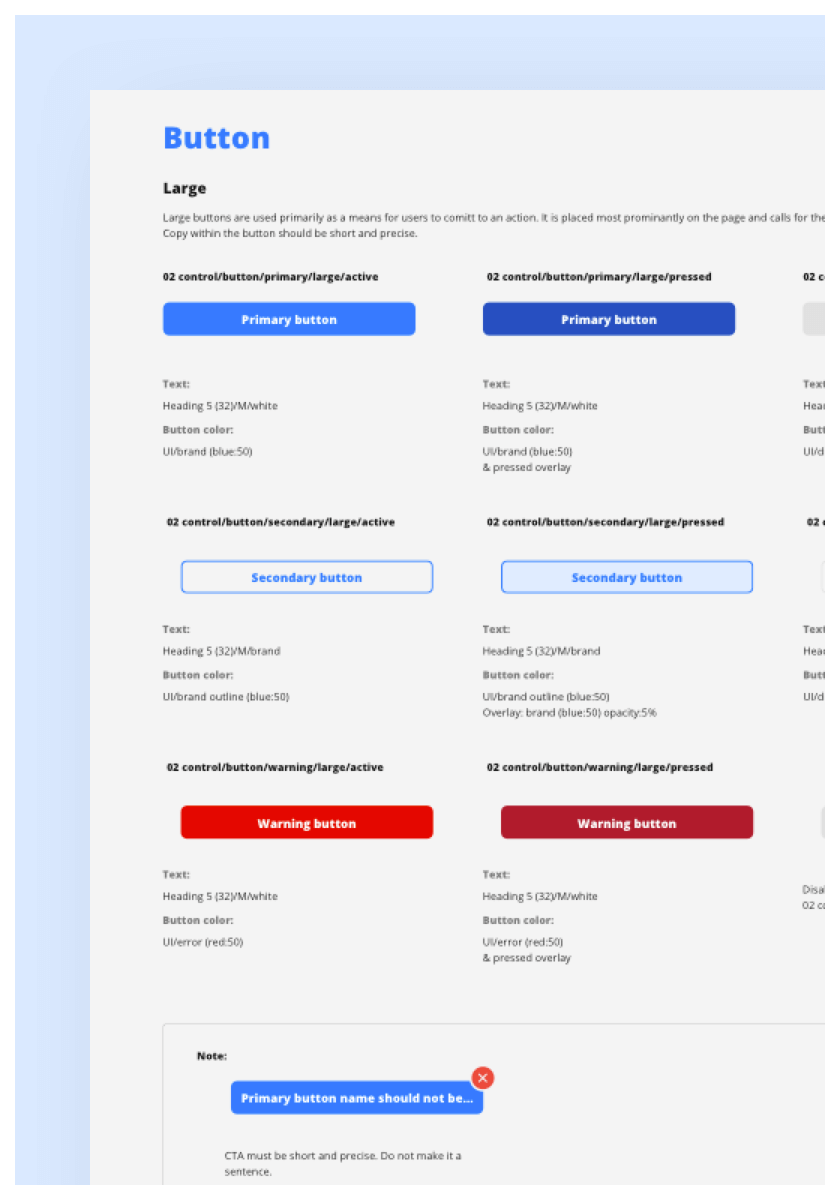
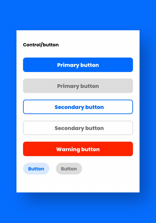
Component library guideline example: Buttons.
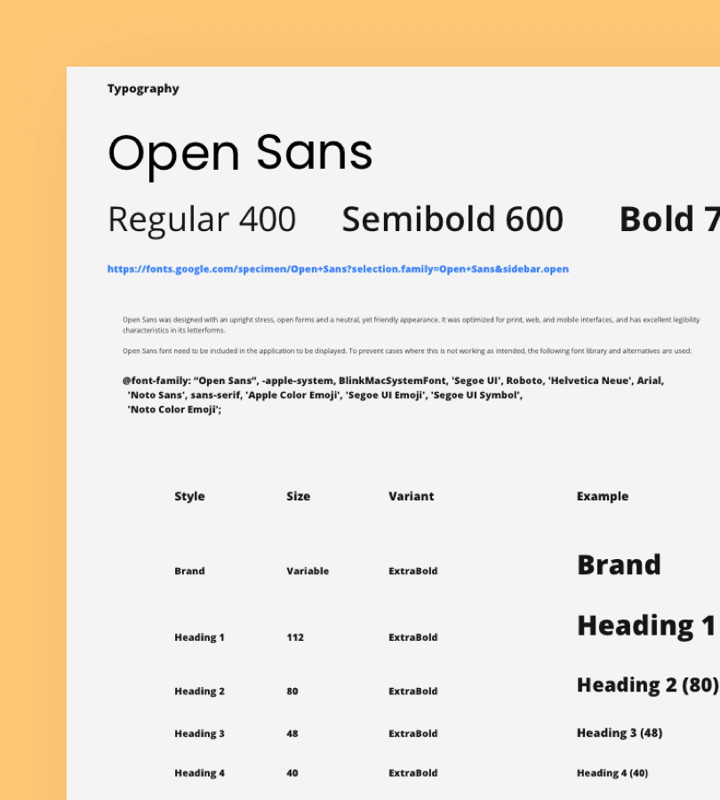
Design system document: Typography.
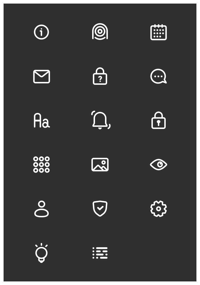
Icons on black.
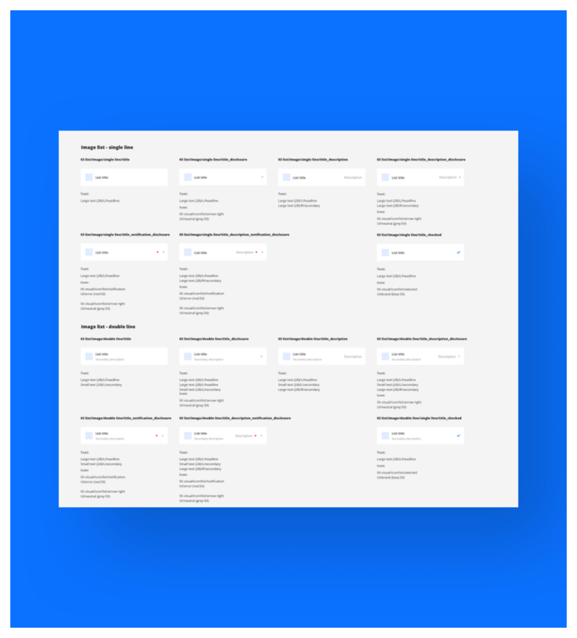
Component library guideline example: Lists.
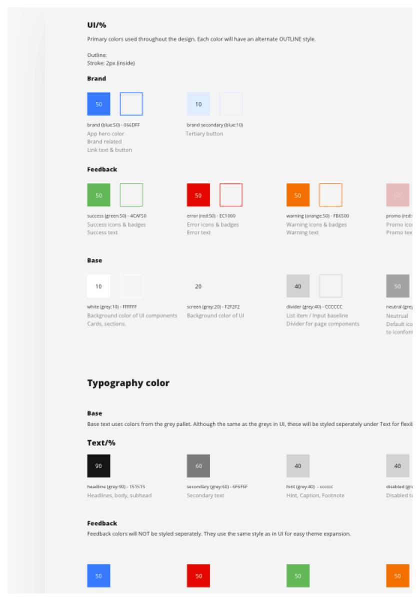
Design system document: Color.
Icons on white.
Illustration System
Following the trend of making tech companies appear more friendly, a set of "Allegria" inspired illustrations were created to support the visual makeup of the UI. These illustrations serve as a guidance and provide a peace of mind to the users. And they are also just kinda fun :)
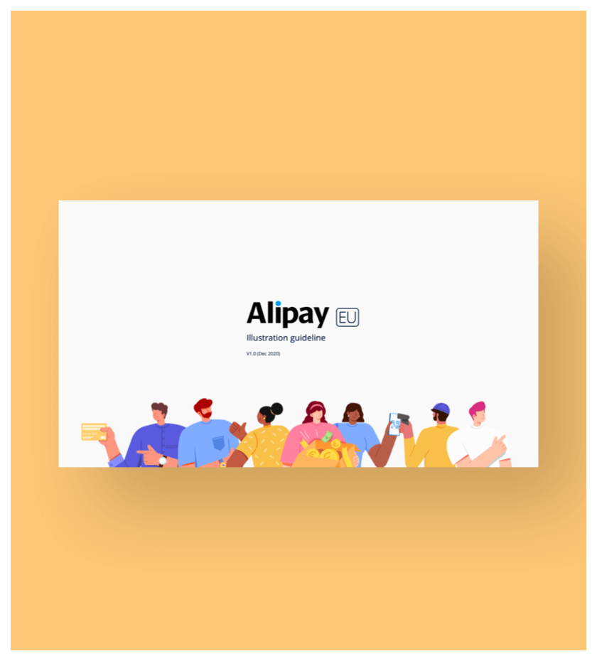
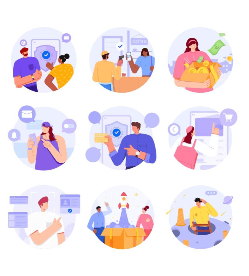
Illustration system example: Samples

When possible, our characters will be animated.
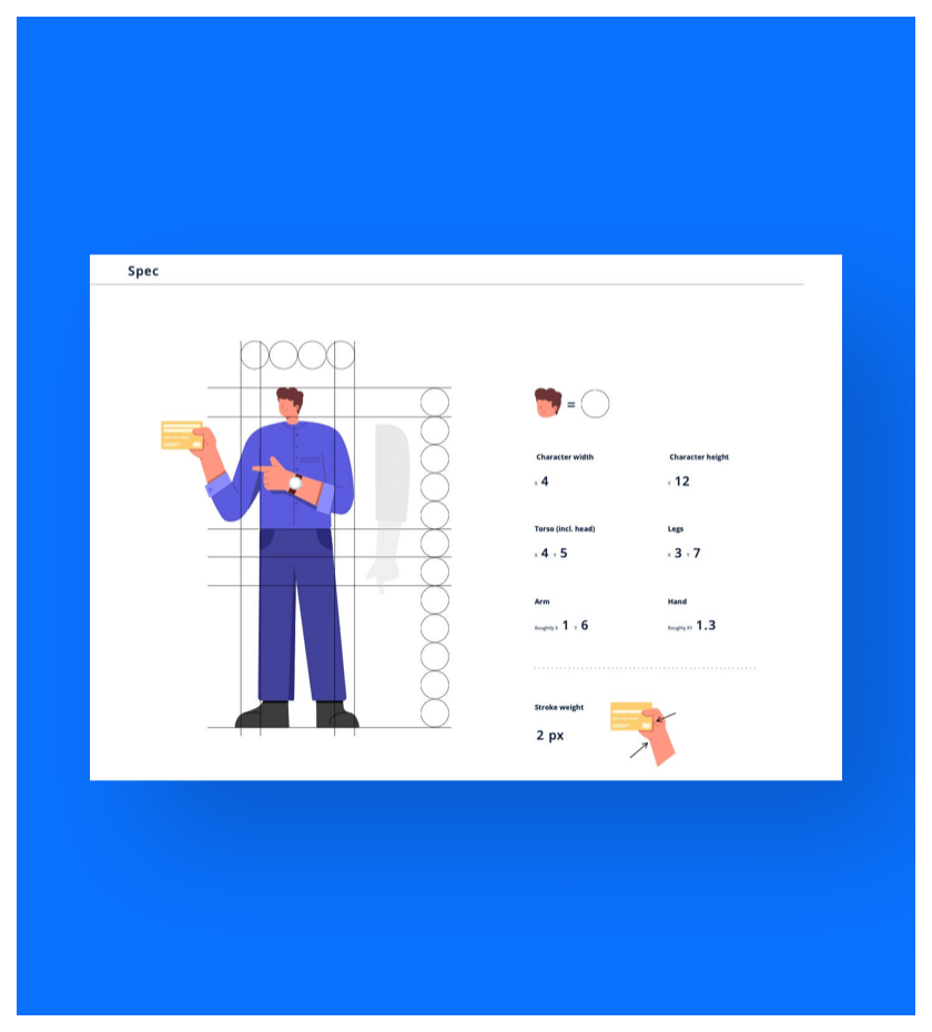
Illustration system example: Character building.
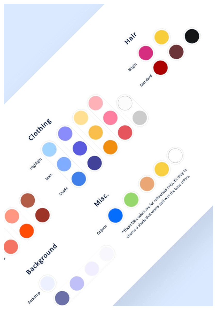
Illustration system example.
Hey what's up?
Components in Motion
Motion was a big part of the design, as it helps greatly with providing users with more guidance, and at the same time injecting certain personality into the UI.


To wrap up, a huge amount of effort was put into AlipayEU, we believe we have created a product that would be accepted and loved by our EU users. Let's just hope they get to experience it soon enough.
Peace.