Designing for 3million users.
AlipayHK is Hong Kong’s top finance app. Currently making 3million users’ lives easier by offering a wealth of features centering around payments. More evident than ever before is the rise and acceptance of the ‘Super App’; apps that aggregate functions and services around people’s day to day. Payments to merchants, payment to friends, paying for phone/data bills, gas, electric and water bills, riding the Metro, buying insurance, and much more, with many more features in the future. It’s an ecosystem that’s constantly evolving.
My involvement with AlipayHK can be broken down into 4 phases;
From conceptual design to launch of v1.0
Keep the ship running, handling and executing new request from Business and Operations.
Handing off to local design team which I’ve helped hire during v2.0
Redesigning v3.0 dashboard, and working out a design system for scaling.
Dreaming
Everything has to start somewhere. This marks my first project at Alipay and it’s the very non-joint venture eWallet app from Ant Financial. As the sole visual designer I was allowed much freedom in terms of how I wanted to go about the UI design and overall style definition. After some thought and internal dialog, I rented a Sony a7sII and flew over to document the whatnots to aid me in telling and selling a visual story of the design. Here is the video:
To be perfectly honest, there’s already a visual language in my mind, one that is vibrant, uplifting and relaxed. This translates to the generous use of colours and gradients, more white space and depths.
To support this direction I purposefully injected my own narrative into the video. By muting the contrast and saturation (although that’s what HK is like most of the time anyway, don’t @me), picking a downer tune, the slow motion to capture more emotion, I crafted a somber tone. Which in contrast, stands to reason why the visual direction is the opposite. I wanted to create a digital environment that lets its user to feel positive, let them take a breather in the chaos that is the urban metropolis.
The proposals are showcased below:
Take-Off
While one of the proposals got the go ahead, inevitably we were struck by the almighty resource / time issue. In the new deadline we had to work smart and leveraged large parts of design from the Chinese mainline Alipay app. This ended up being a double edged sword. While it made deadline and was a perfectly usable product, the experience itself suffered severely.
The Chinese mobile app interaction and design employs a completely different approach and philosophy than most Western counterparts. This is a whole topic in itself which we won’t get into here. So, yes, the app is fine and we still managed to reach a respectable AAU, it could still be much better. The majority of the complaints we received were regarding the way we displayed information and how users interact with the app. A recurring comment was that it’s “Too Chinese”, a valid critique with a subtle political undertone perhaps (I’m not opening up that can of worms).
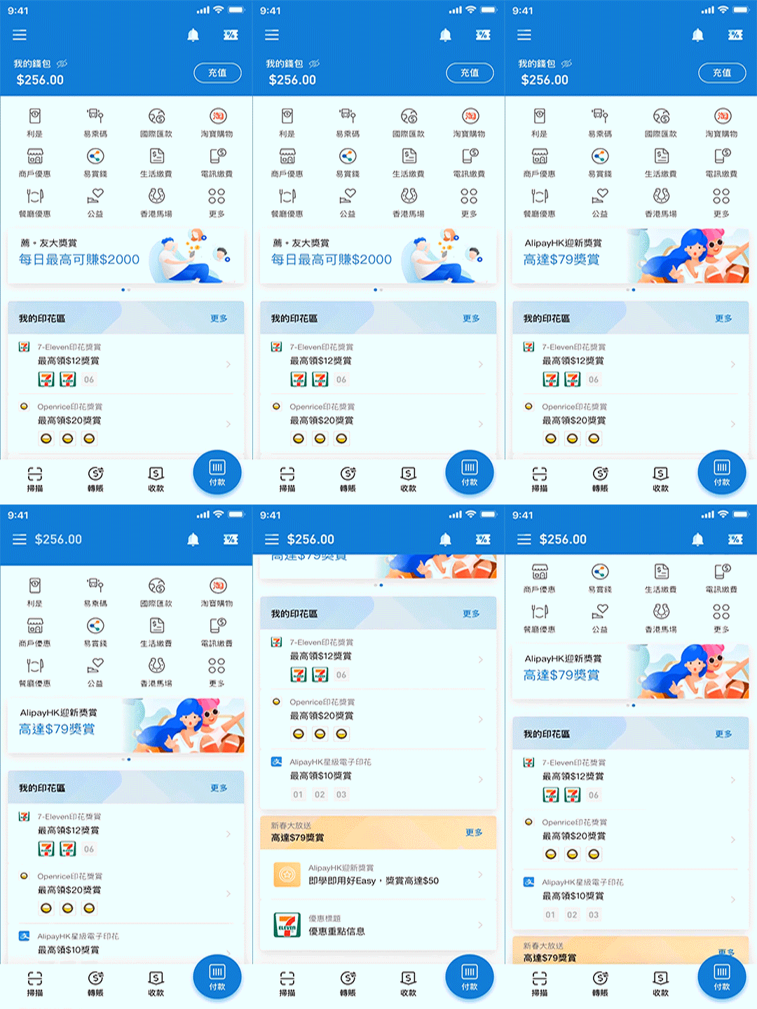
The one highlight that is a huge success is the e-stamps promotions that’s been a fixture since the inception. This resonated very well with the Asian market and is an incredible tool/design to push that sweet sweet DAU/MAU. Think of it as a loyalty card that operates on the App level and also the signed Merchant level. Users get stamps for continuous usage at their preferred offline merchant (7-Eleven for example), they receive a cash rebate once the goal is hit. We get good numbers and the merchants are happy to sign with us. Win Win Win!
Another feature that’s worth mentioning is the Remittance function. Which is made possible by the brilliant payment network backend that’s way too technical for me. This allows funds to travel between Apps in the Alipay global network, in this case, the two apps are AlipayHK and GCash from the Philippines. We poured a lot of resources into this feature as we’ve seen the hardships of the people that need this service the most (OFW in HK). Spending their one free day in the week lining up to remit to their spouse back home at a high fee, and their spouse having to pick up the transfer at an offline pawnshop many days later. We learned of our user stories by visiting them and truly get to know them.
Check out some of the key screens from V2. (There actually is a V1, but I don’t feel like talking about it.)
Log in screen with HK landscape video background / Home / My Profile / Onboarding / Payment (B scan C , C scan B) / Cashier / P2P Transfer / eStamp & Promos / Remittance
A short doco of Alipay and GCash UED members conducting onsite interviews to understand our users and their stories. Shot on my ancient iPhone6s with DJI handheld gimbal. Narrated by my soothing voice.
Respecting Our User
After maintaining V2 for a year and help building a local design team, I eventually took on less roles and started putting more focus on other products. I ended up coming back for the Homepage redesign project, which would end up being V3. This time our focus was clear and we had enough research and data to optimize and have strong rationales to back up the designs.
Some major complaints from V2:
• long feed that’s impossible to tell whether there is anything new or noteworthy to click on • having to go through a couple of levels to see eStamps • unfamiliar navigation • overwhelming features • unfamiliar colour palette (I should have done a more thorough study on this.)
To address them here are our optimizations:
• aggregated feed cards which bundle all relevant promos to reduce clutter on Home • displayed eStamps progression in an aggregated manner in one eStamp card on Home • incorporated familiar interaction model such as the hamburger menu ( I know, I know, I don’t know either) • moved and organized key functions to bottom for reachability and highlighted payment as the most prominent action • updated palette to reflect culture taste
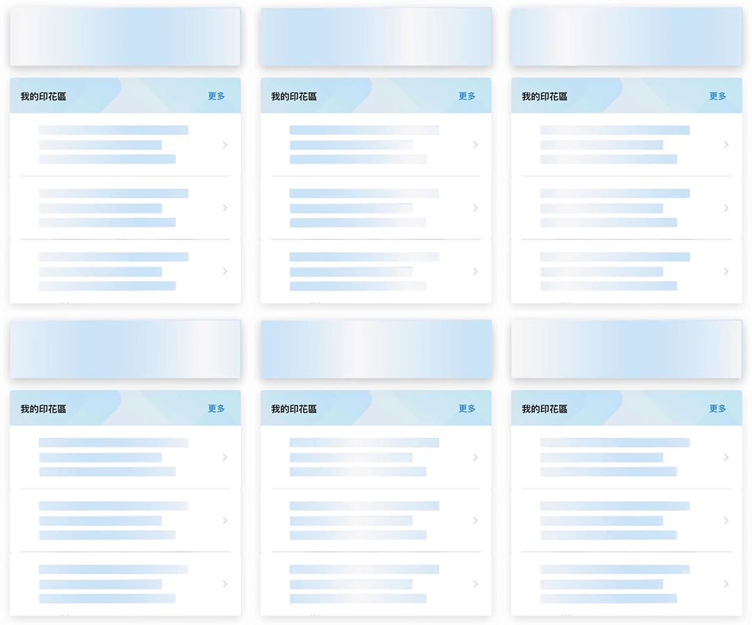
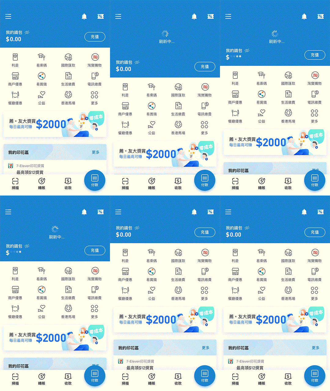
Of course we prototyped (using Principle).
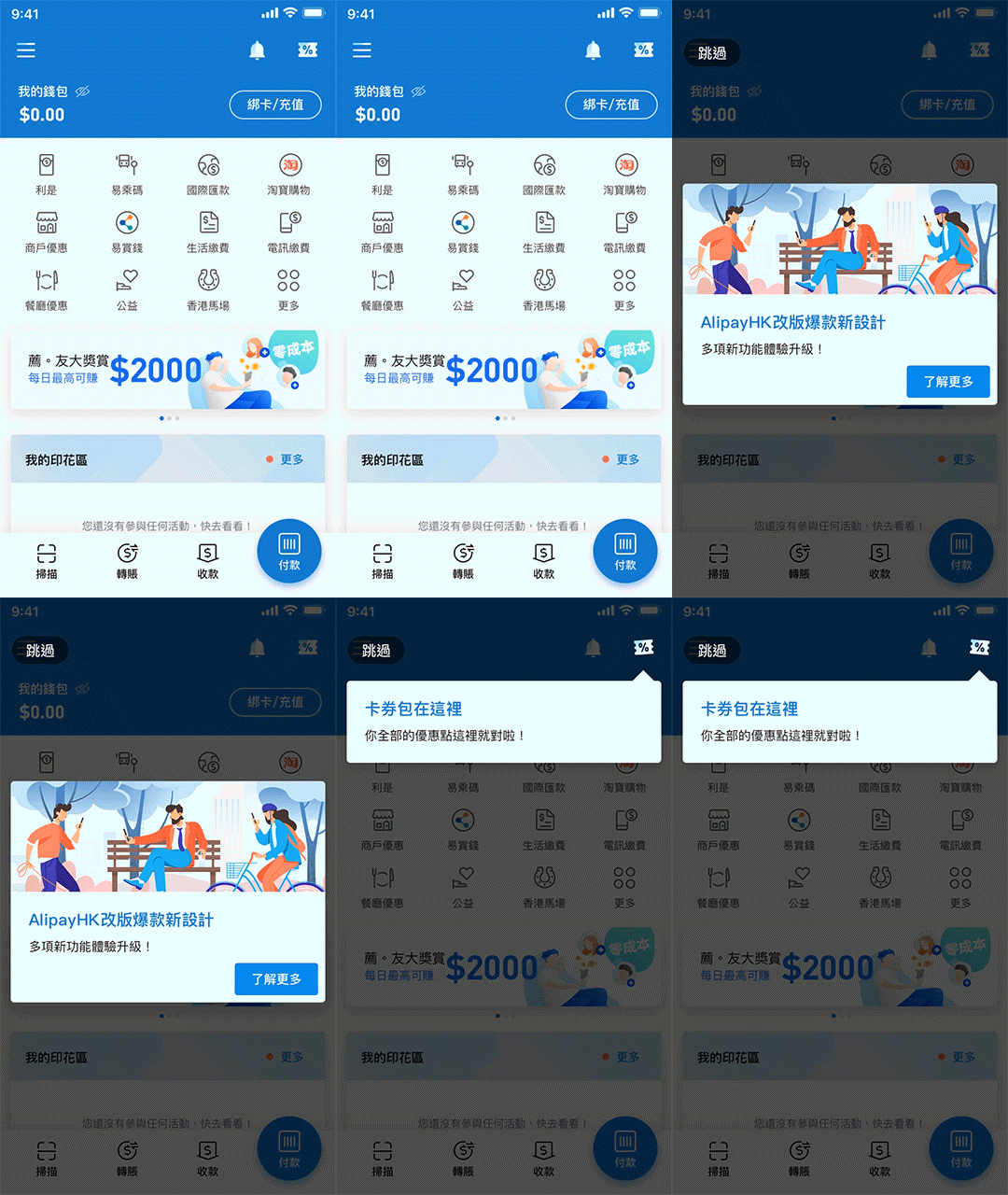
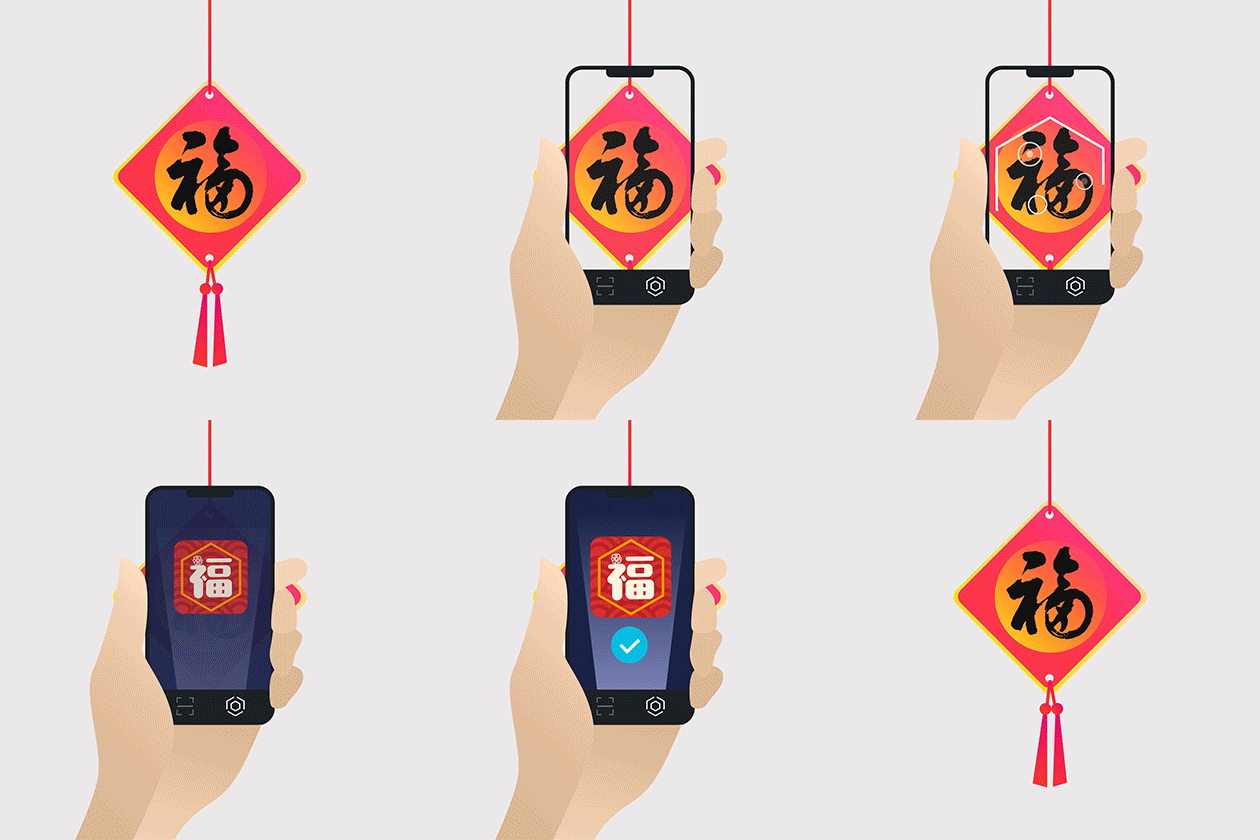
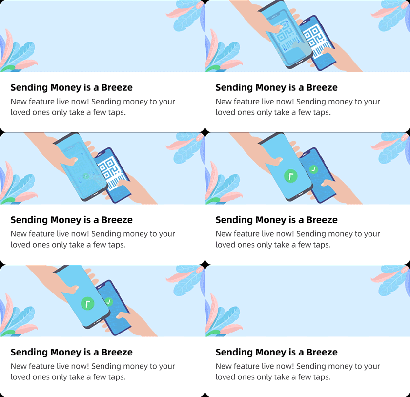
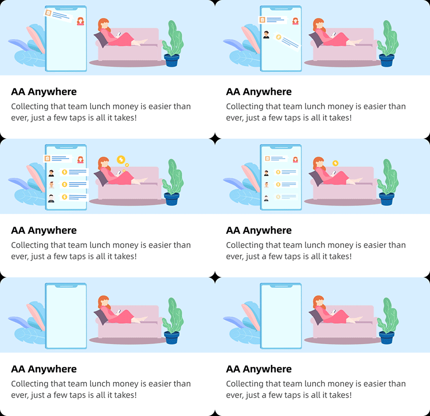
At the same time we started to incorporate Lottie for our educational pages and modals as well as promotion campaigns, this is a fantastic way to effectively communicate product features without being all so boring. Lottie is amazing. I love it.
The updated version was very well received by the public. Ultimately what we did was really listened to our users and provided them with an experience that they’re accustomed to. This had been a long journey, one that I’m hugely proud of to be a part of.
Peace.


